


PURPOSEFUL STORYTELLING
Hi, I’m Shaina "Shai" Kent — a visual and brand designer who loves storytelling, clarity, and community.
I bring ideas to life through design that’s both creative and clear. With a background in education and over 15 years of leading creative school initiatives, I now focus full-time on design — blending strategy, visuals, and human-centered thinking.
From branding and websites to learning tools and print materials, I help organizations share their story and connect with their audience. My sweet spot is where design meets purpose — making complex ideas simple and experiences more engaging.
With a strong eye for detail, collaborative spirit, and project management know-how, I design with people in mind — to teach, inspire, and make an impact.
THE WORK BEHIND THE VISUALS
A vibrant mix of strategy, storytelling, and style — this portfolio showcases the range of my creative work across branding, web, product, and instructional design. From bold visual identities and polished websites to educational tools, event collateral, and surface pattern collections, each project is grounded in purpose and built to connect.
Whether I’m crafting a brand from the ground up, designing a digital learning experience, or developing products that tell a story, I blend creativity with intentionality to transform ideas into visuals that resonate, inspire, and make a lasting impact.
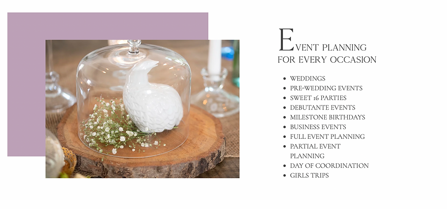
EXQUISITE EVENT
BRANDING + WEBSITE + VIDEO EDITING
It's all in the details - Developed a dynamic website is always important in the process. This site was designed to serve multiple purposes: attracting new clients, show the brand aesthetic and voice, call-to-action, lead generator, and more for desktop, tablet, and mobile breakpoints.


THE KURVY COUSIN
BRANDING + SOCIAL MEDIA
The Kurvy Cousin is a branded YouTuber who focuses on body positivity. This bright and though provoking brand is meant to serve professions from all walk of life and genders as they try to navigate the ups and downs of bariatric surgery. We created a cohesive brand strategy, logo, variations, favicons, and social media package for this client.


POPPY REDS
BRANDING + PRODUCT DESIGN
A bright and colorful beer based seltzer was designed with a fun spirit in mind. This brand was designed to evoke freshness with an artistic flair. We created a brand board and guide paired with our one-logo concept reflecting a young modern twist. A main logo, variations, and favicon were created for this brand package.


ELEVATE & CREATE
LXD | INSTRUCTIONAL DESIGN
This two-part ILT experience prepares elementary students for a school art exhibit. Designed for General Ed teachers, it includes instructional videos, a quiz, worksheet, reflection prompts, and structured lessons to support student learning before and after each exhibit tour.
From scripting and storyboarding to producing videos and creating aligned classroom materials, the project demonstrates key instructional design competencies including backwards design, learner-centered content development, and engaging visual storytelling. Aligned with visual arts standards and social-emotional learning goals, this series supports both educators and students in delivering meaningful, standards-based creative learning experiences.


BEHIND THE DESIGN
Step into an interactive e-learning micro-course designed to support both students and parents. Rooted in child-centered pedagogy and adult learning andragogy principles, this experience models best practices in instructional design — blending engaging, age-appropriate content for children with practical, purpose-driven guidance for parents.
Here’s a look at how the course was brought to life
1 | ACTION MAP
Every design begins with clarity. Using an action map, I outline what learners need to do—not just what they should know. This helps me build content that’s focused, purposeful, and aligned to real-world outcomes. For this project, I mapped out two learning paths: one for students preparing for an art exhibit and one for parents looking to support their child's creative journey.

2 | STORYBOARD
Next, I build a visual roadmap of the course. The storyboard helps me organize ideas, narration, and key visuals scene by scene. It’s like a blueprint, showing how the story will flow, what the learner will see, and how each step connects to the next.
.png)
3 | VISUAL + TEXT MOCKUP
Once the structure is set, I bring the vision to life with mockups. This includes sample screen designs, text content, and visual elements that reflect the final look and feel. Here, I ensure the design is accessible, age-appropriate, and visually engaging for both students and adults.

4 | INTERACTIVE PROTOTYPE
With a working prototype, users can experience how the course functions. Buttons click. Videos play. Activities respond. This stage allows for testing navigation, pacing, and clarity—making sure the course is both interactive and intuitive before full development begins.
5 | FULL DEVELOPMENT
In the final stage, everything comes together. The course is fully built out with animation, audio, interactive elements, and assessment tools. The result? A polished, responsive, and user-centered learning experience that’s ready to inform, engage, and inspire.

WORK + IMPACT
Explore the range of my professional experience across instructional design, senior-level graphic and brand design, and arts education. Each resume highlights a different facet of my work — from developing standards-aligned learning experiences and leading cross-functional creative teams, to fostering student growth through culturally responsive teaching.
Whether you're looking for a designer who understands how people learn, a creative who can lead brand strategy and execution, or an educator with a strong foundation in communication and engagement — you’ll find it here.
